True Supportive Care
The Task:Create a unified, professional online presence that expanded on their existing brand while maintaining warmth and approachability. The goal was to bring consistency across their visual identity, refine their messaging, and design a website that clearly communicated their values and services. The new site needed to be easy to navigate, accessible to a broad audience, and simple for the team to update internally — reflecting the supportive, person-centred care they provide.

The Solution
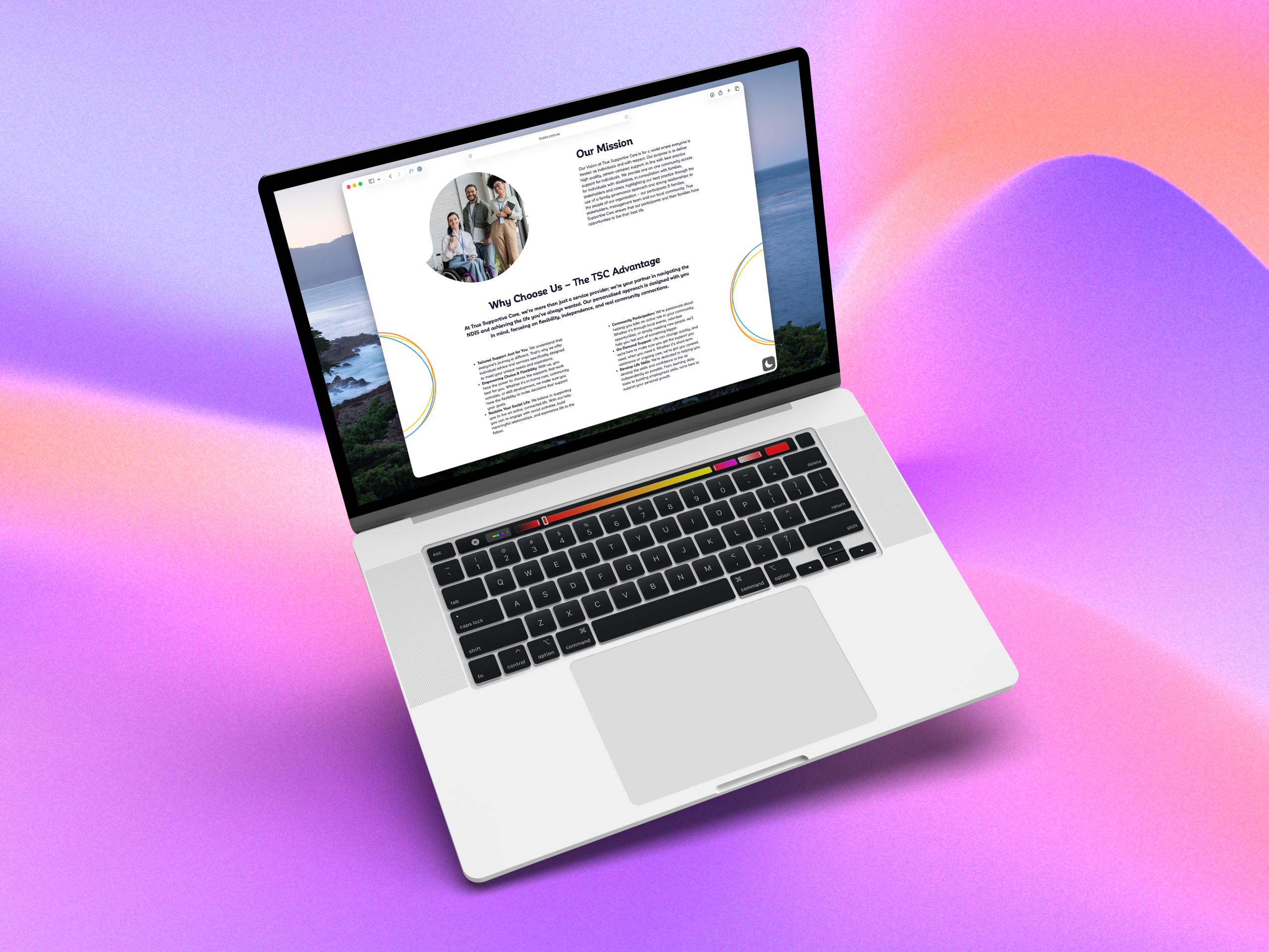
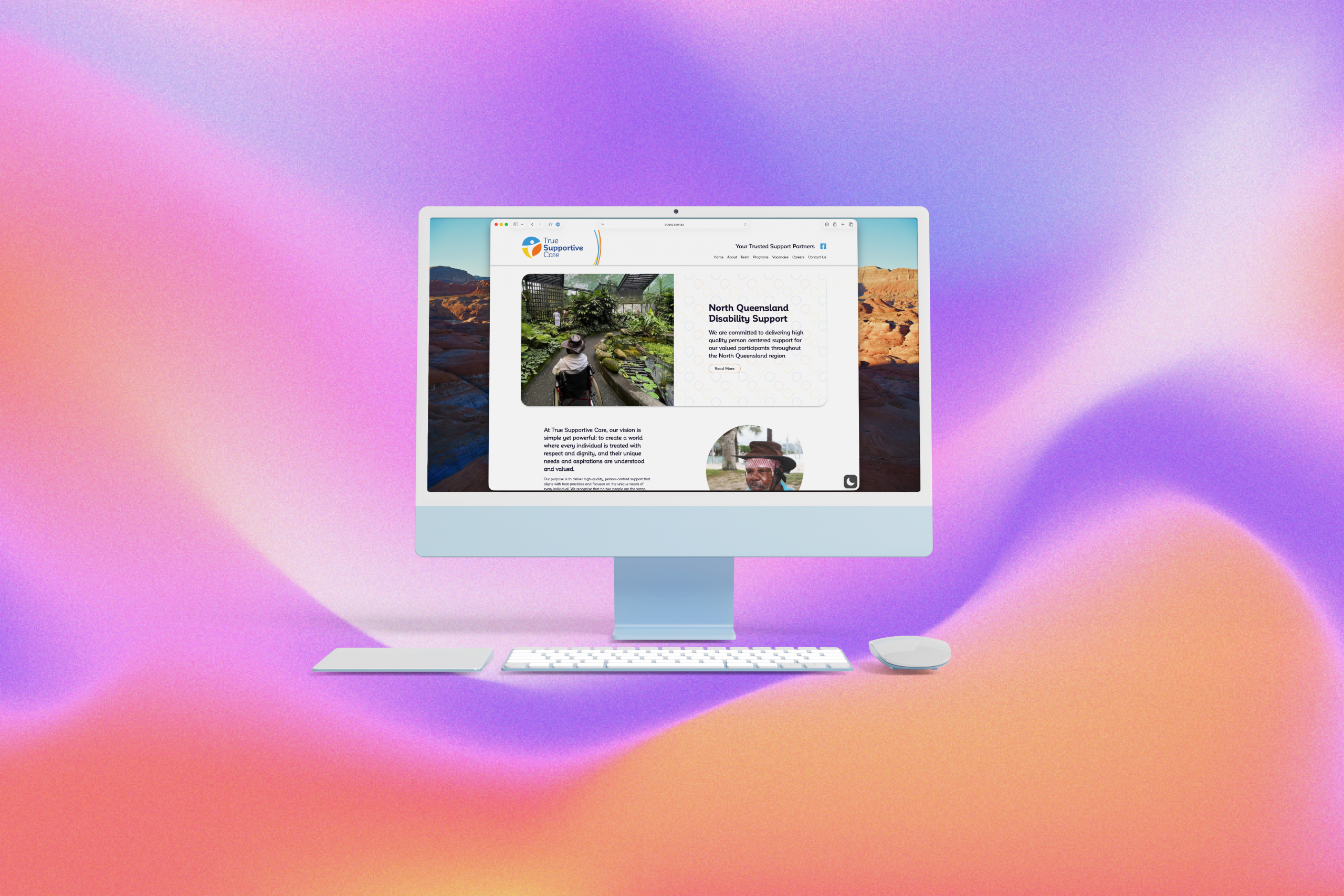
We began by expanding and unifying the True Supportive Care brand to create a consistent, recognisable identity across all touchpoints. The goal was to preserve the warmth and compassion at the heart of the organisation while refining its visual presentation and messaging. Through updated colours, typography, and brand assets, we established a clear, professional look that still felt human and approachable.
As part of the rebrand, we developed a distinctive visual element we call the rings — a soft, circular motif symbolising connection and support. These rings appear across the website, business cards, brochures, and other materials, tying every piece of communication back to the same core identity. Alongside this, we created a complementary brand pattern that can be used flexibly across print and digital platforms, giving the brand cohesion and texture without overwhelming the design.
Working collaboratively with the client, we also refined the site structure and content to make information easier to access. The finished WordPress website is clear, modern, and simple for the team to update internally, providing a solid foundation for future growth.
The result is a unified, professional brand that feels genuine, inclusive, and deeply aligned with True Supportive Care’s purpose.